 http://maps.unomaha.edu/AnimArt/ActiveLegend/Peterson.html
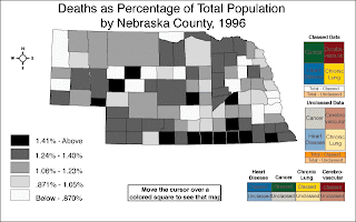
The Cartographic animation above is of the percentage of deaths by population for the state of Nebraska, 1996.
Cartographic animations illustrate the movement of geographical phenomena that develops within specific topics.
No comments:
Post a Comment