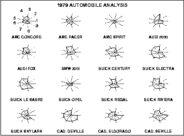
 Above are Star plots of 1979 Automobile analysis.
Friday, August 8, 2008



Triangular plot
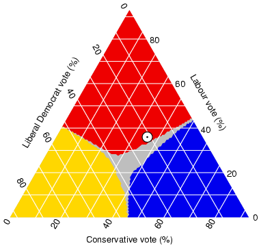
The Triangular plot above shows the estimated fraction of the population intending to vote for each of the major parties
Windrose

Above is a Windrose showing the relative frequency of directions from where the wind is coming from.

Population profile

Above is a Population profile illustrating the population profile for Australia's Northern territory from 1986-1995.

Index value plot

Above is an example of an Index value plot is "of Average Streamflow Index, plotted as the red line on the above graphs, is calculated each day as the average of the streamflow index values for all the stream gaging stations in the state or water resource region having at least 30 years of record".
Accumulative line graph or Lorenz curve
 Above is an example of an Accumulative line graph or Lorenz curve.
Thursday, August 7, 2008

Nominal Area choropleth map

Above is an example of a Nominal area choropleth map of the "California % Black Condo Owners".

Standardized Choropleth map
 http://www.bbc.co.uk/scotland/education/bitesize/standard/img/geography/population/g156.gif
Above is a Standardized Choropleth map of the world's population density.
Univariate Choropleth map
 http://www.cartisan.com/map_resources/map_types/images/choropleth.jpg
Above is a Univariate Choropleth map of the percentage mean for each states electoral votes for the 2004 presidential election. This map may also be considered a propaganda map.
Bivariate Choropleth map
http://www.directionsmag.com/images/articles/sportsillustrated/Olympic_Athletes.jpg
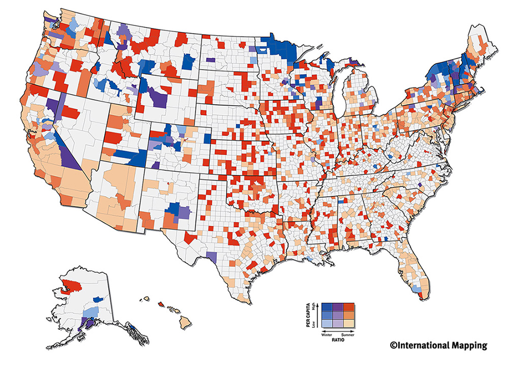
Above is a Bivariate choropleth map of U.S. Olympic Athletes' home areas, based on high(darker shades) or low (lighter shade) per capita and winter(blue) and summer(red) olympic athletes.
Unclassed Choropleth Map

http://www.blogger.com/post-edit.g?blogID=6932841296169209324&postID=1035458377811982688
Above is an example of an Unclassed Choropleth Map of the 2006 percentage of population 14 years or younger in Canada.
Tuesday, August 5, 2008
Classed Choropleth maps
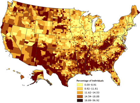 Above is a Classed Choropleth map of Percentage of individuals living in poverty, by county in the United States in 2000.
Range graded proportional circle map
 http://pubs.usgs.gov/fs/fs-004-03/
The Range graded proportional circle map above is of river characteristics discovered during the Lewis and Clark expedition.
Subscribe to:
Posts (Atom)