Sunday, August 3, 2008

Flow map

The Flow map above displays the movement of freight transported over water from Hawaii to the United States for 1998.
A Flow map is used to illustrate the movment of specific data from one location to another.

Isoline map


http://www.waterpowermagazine.com/graphic.asp?sc=2049536&seq=6
The above is from the International Water Power and Dam Construction; it "illustrates the temperature Isoline Map at crown section during operation period (January 31, 2005); Right: Figure 9 รข€“ The temperature isoline map at dam vertical section during operation period (January 31, 2005)
An Isoline map employ continuous lines with joining points of the same value in order to illustrate identical information in different geographical and atmospheric conditions.

Proportional Circle map

http://www.neiu.edu/~jrthomas/377/circle.jpg

Above is a Proportional Circle map of the Mexican population in Western United States in 1990.

Dot Distribution map


Above is a Dot Distribution map of the 2000 populaton distribution of the United States. Each dot represents 7500 people. A Dot Distribution map basically uses dots to represent numerical data for specific geographical regions and areas.


Choropleth map


The Natioanla Highway Traffic Safety Administration :

Above is a Choropleth map of California's 2006 alcohol related fatalities by county. A Choropleth map is a thematic map in which colored or shaded areas are in direct proportion to the measurement of the numerical or statistical information.


Propaganda map


http://www.calvin.edu/academic/cas/gpa/images/heer/heer1.jpg

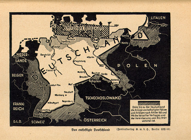
The above is a Propaganda map from a "1935 book titled 'Army, Navy and Air Force', a small book that wanted to demonstrate that Germany was surrounded by hostile countries". The title of this map is "Demilitarized Germany"; which displays the demilitarized regions that were imposed under the Treaty of Versailles.

A Propaganda map is used to influence people for political or social reasons by manipulating or distorting the facts on the map.

Friday, August 1, 2008

Hypsometric map

http://www.rrcap.unep.org/centralasia/reapreport/Map/MOUNTAIN/map_2.jpg

Above is a Hypsometric map of Tajikistan ; the dark red color represents the highest elevations, while the green represents. A Hypsometric map is a map that is used to illustrate topographic surveys. This type of map displays the different elevations by different means; such as shading, coloring, tinting or even contours.